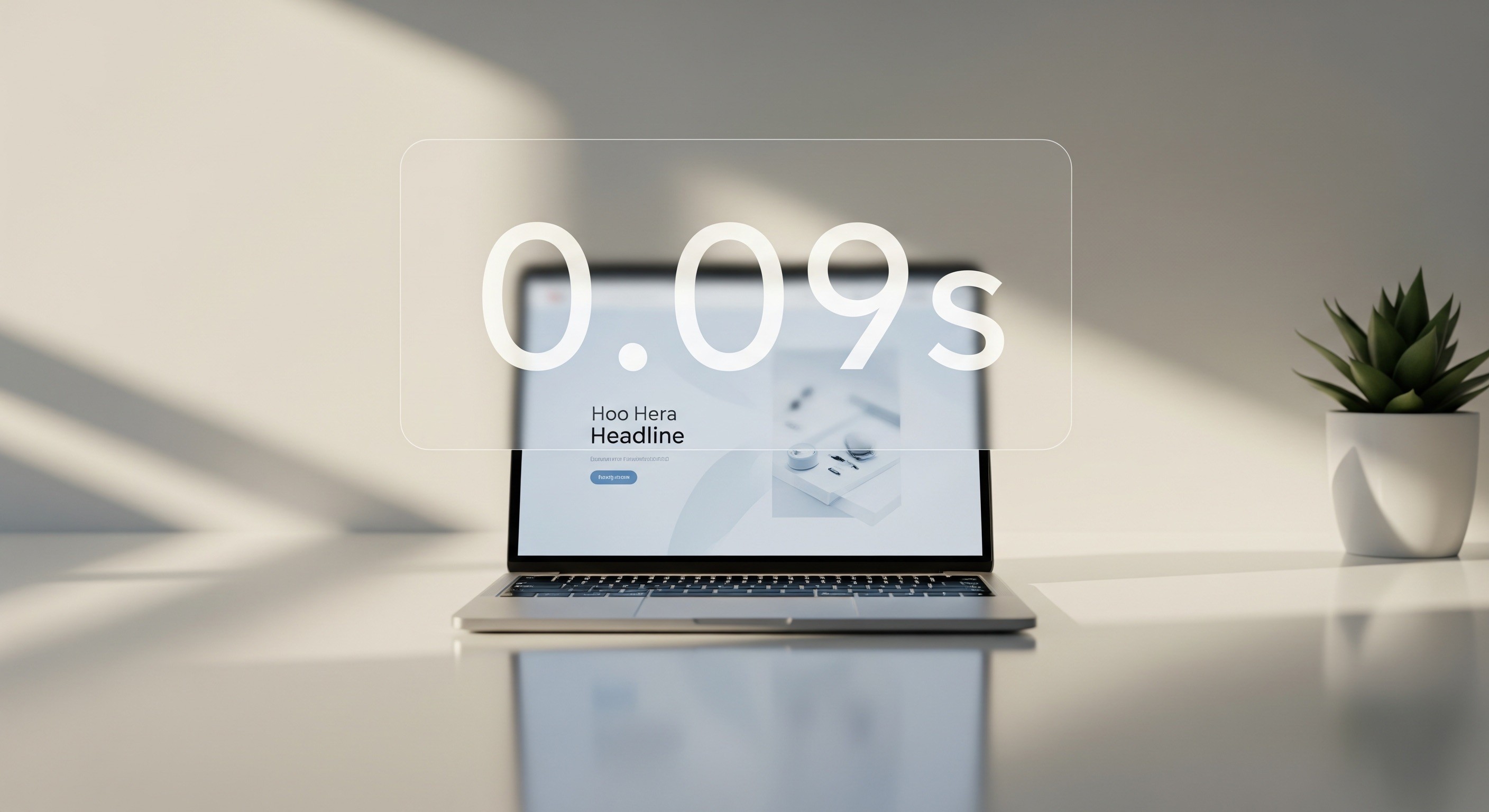
Fast UX Beats Fancy UI: What High-Pressure Products Actually Need
Open any design awards site and you will see beautiful interfaces. Many of them would be a disaster inside a real product.
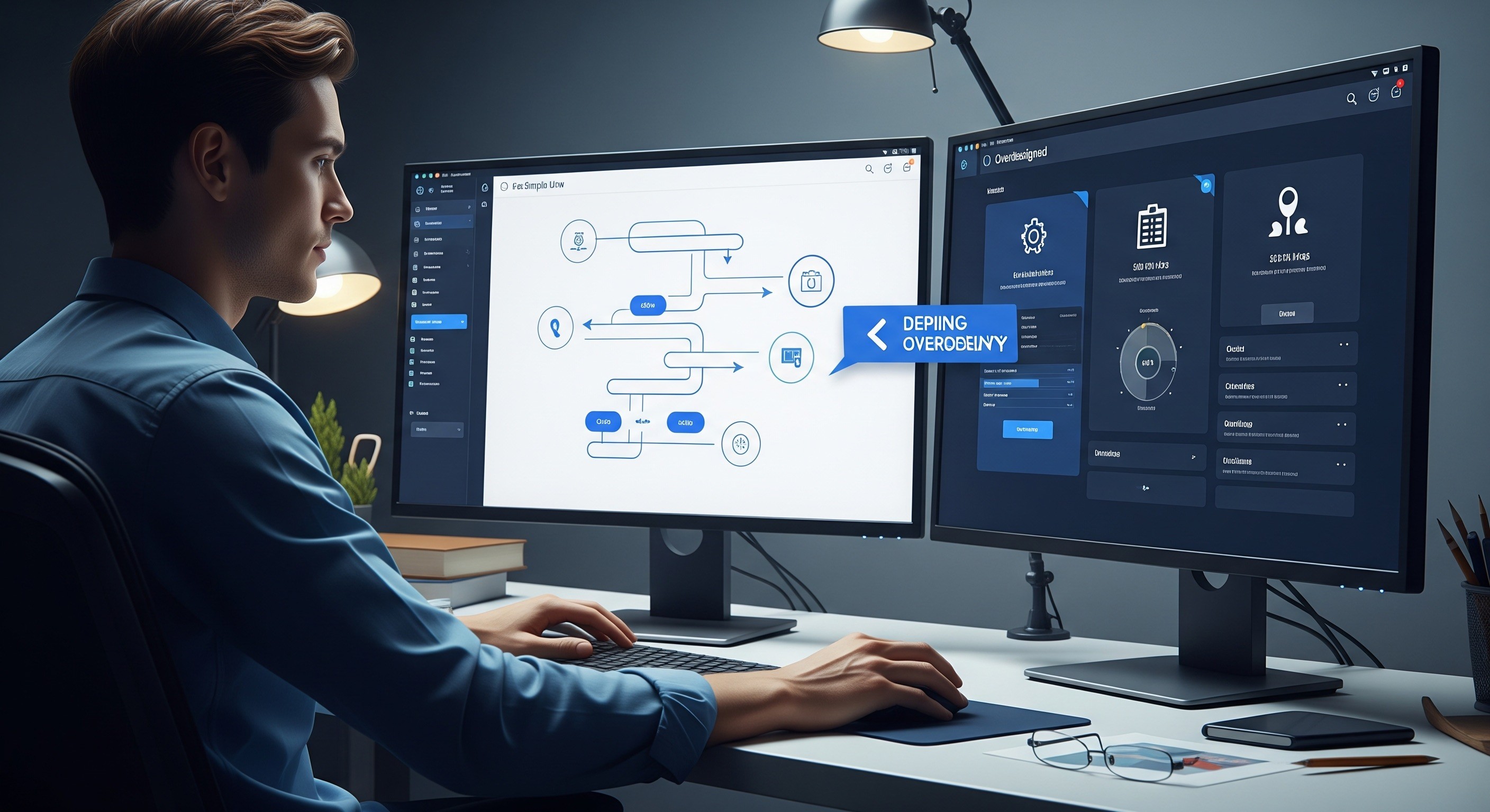
Open any design awards site and you will see beautiful interfaces. Layered gradients. Buttery animations. Hero sections that look like film posters. Plenty of them win awards. Many of them would be a disaster inside a real product.
In high-pressure environments, SaaS dashboards, booking systems, logistics tools, admin panels, anywhere users are trying to get something done under time pressure, beauty is not what users are paying for. Speed, clarity, and low friction are what users are paying for.
This is the case for fast UX over fancy UI, and why the teams that understand the difference ship better products.
Fancy UI Slows Users Down
A 400ms page transition looks elegant in a portfolio. Repeated forty times a day by a support agent clearing a ticket queue, it is a productivity tax. A decorative illustration in an empty state feels warm, until the user has seen it four hundred times and just wants the data.
Extra steps, extra visuals, extra moments of "wait for it" all compound. In consumer marketing sites, polish wins. In operational products, polish you cannot turn off becomes friction.
Fast UX Reduces Cognitive Load
Fast UX is not about how quickly the page renders. It is about how quickly the user can act.
The hallmarks of fast UX:
- Fewer decisions per screen
- Short, predictable paths to the main tasks
- Clear, literal labels: no clever copy for functional buttons
- Consistent placement of primary actions
- Minimal friction between intent and outcome
- Keyboard shortcuts for power users
When a product feels fast, users trust it. When they trust it, they rely on it more. When they rely on it, they stay.
High-Pressure Products Need Predictability
A dashboard used every day by the same people is not the same thing as a marketing site seen once. Daily-use products reward muscle memory. Users should not have to re-learn where anything is. Anything that moves, changes, or animates by default is something they have to reprocess.
Predictability means:
- The same action lives in the same spot across screens
- Primary buttons look and behave identically
- Loading states appear in consistent patterns
- Confirmation language stays the same
- Nothing shifts position while the user is looking at it
Consistency does not kill creativity. It lets creativity apply to the right problems, not to the navigation.
Fast UX Helps Teams Ship Faster Too
There is a production argument for fast UX as well. Simple, intentional systems are cheaper to design, cheaper to build, and much cheaper to maintain.
Teams that prioritise fast UX tend to see:
- Shorter design cycles because patterns are reused
- Fewer revisions because the brief is clear
- Faster dev handoff because the UI is predictable
- Smoother onboarding for new hires
- Fewer bugs because there is less surface area to break
Fancy UI is expensive to build and even more expensive to change. Fast UX compounds in both directions: it helps users and it helps the people shipping the product.
Aesthetic UI Still Matters, Just Not First
None of this is an argument for ugly products. Visual craft matters. Thoughtful typography, calm colour, considered spacing all make a product feel trustworthy and modern.
The order is the point. Build for clarity first. Add polish second. A product that is clean, fast, and beautiful is the goal. A product that is beautiful but slow and confusing is just a nicer-looking problem.
What This Means For Your Product
If your product is showing signs of UX drag, rising support tickets, onboarding complaints, feature discoverability issues, user complaints about "feeling slow", the fix rarely lives in the visual layer. It lives in the flow.
Audit your five most-used screens. For each, ask:
- What is the primary task here?
- How many clicks does it take today?
- What is decorative and could go?
- Where does the user wait, and why?
- If I used this tool forty times a day, what would annoy me?
The answers usually point to an uncomfortable truth: much of what looks designed is just stuff in the way.
Frequently Asked Questions
What's the difference between UX and UI?
UX is the flow, logic, and structure of how a product works. UI is the visual surface: colour, typography, spacing, animation. Both matter, but UX sits underneath and determines whether the product is actually usable.
Is fancy UI bad for SaaS products?
Not bad, but risky. Heavy animation, decorative illustration, and elaborate transitions tend to feel great on first use and frustrating on the hundredth. In tools people use daily, restraint usually wins.
How do I know if my product has UX debt?
Signs include: support tickets about "where is X," power users asking for keyboard shortcuts, new-user drop-off on specific screens, or a feeling that the product is slow even though the code is fast. All of these suggest the problem is in the flow, not the code.
Should we skip UI polish entirely?
No. Polish builds trust and brand perception. The point is sequencing: nail the flow first, then invest in UI refinement. Polish layered on a confused flow just slows down a confused flow.
How do Scandinavian product teams approach this?
Most Stockholm and Nordic product teams lean heavily toward functional minimalism. The design tradition in this region values clarity, restraint, and function over decoration. That cultural bias tends to produce products that feel calm and fast, even when they are handling complex work.
If you are building a product used every day and it is starting to feel slow, we can help. Webray Studio designs calm, fast, and intentional product interfaces out of Sweden, for teams anywhere in the world.
Thinking about your own website?
Start a conversation →One useful idea for your website, every Thursday.
Short, practical notes on design, copy and conversion from the people who build the sites. Two minutes to read, and you can use it the same day.