The client and the brief
Integrate Cyber is a cybersecurity firm in Austin, Texas, offering penetration testing, infrastructure security, AI and IoT testing, and compliance readiness. Their old site worked, but it did little to build trust or explain the services. We had full creative freedom to redesign and rebuild it in Framer.
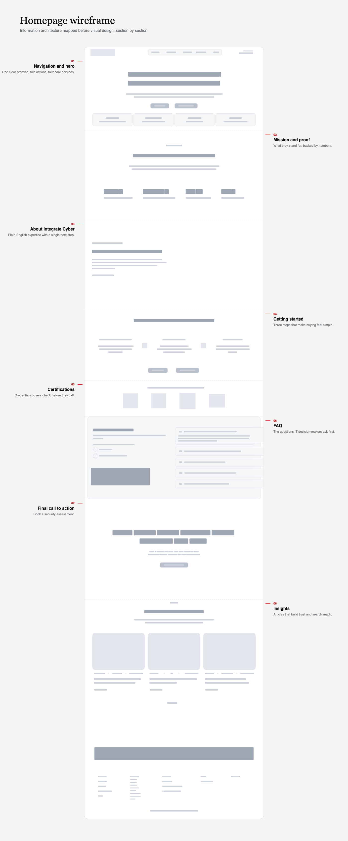
We mapped the information architecture in wireframes first, since visitors arrive with very different levels of knowledge. Then we built on the existing red and black palette with a type system and visual style that suit the logo.
What made it hard
The core problem was making a technically complex offer clear without making it feel simple. Security sites often lean on dark, aggressive styling and jargon, which intimidates more than it reassures.
The site had to show real expertise and still be easy for business owners and IT decision-makers to understand and act on.
What we did
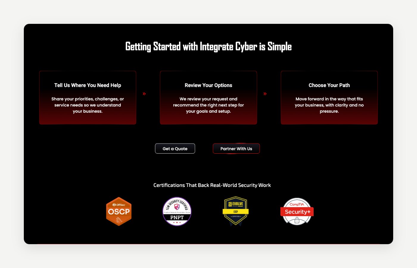
Structure first. Visitors range from business owners to IT leads, so we mapped the information architecture in wireframes before any visual design: what each service is, who it's for and what happens next.
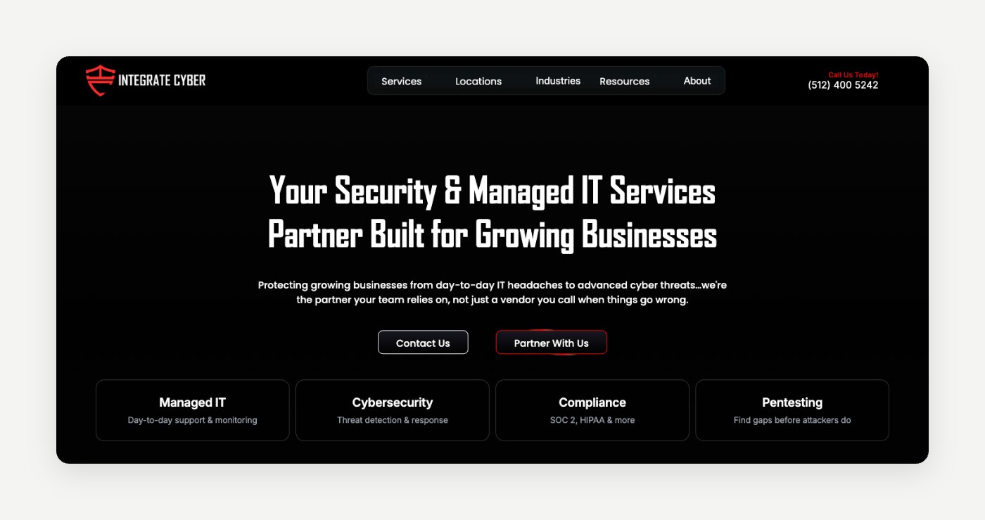
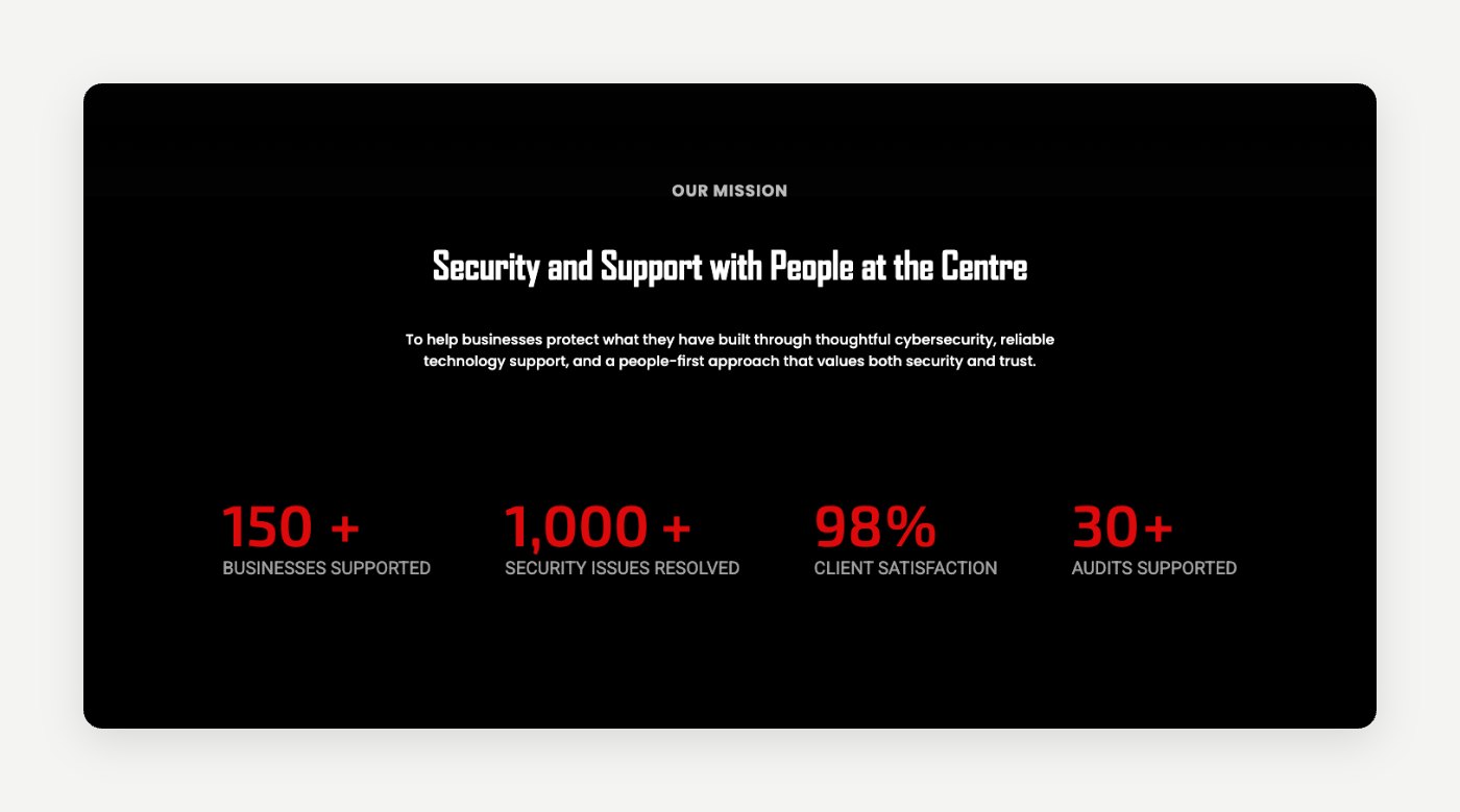
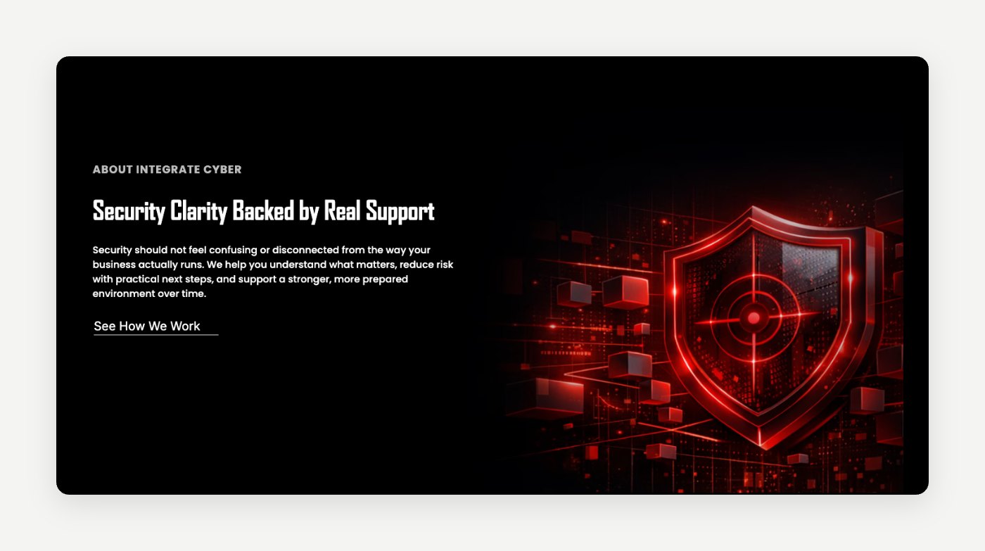
A calmer kind of security site. We kept the existing red and black palette but used it with restraint. Dark, high-contrast layouts, generous spacing and a condensed display face that suits the logo, without the aggressive styling common in the category.
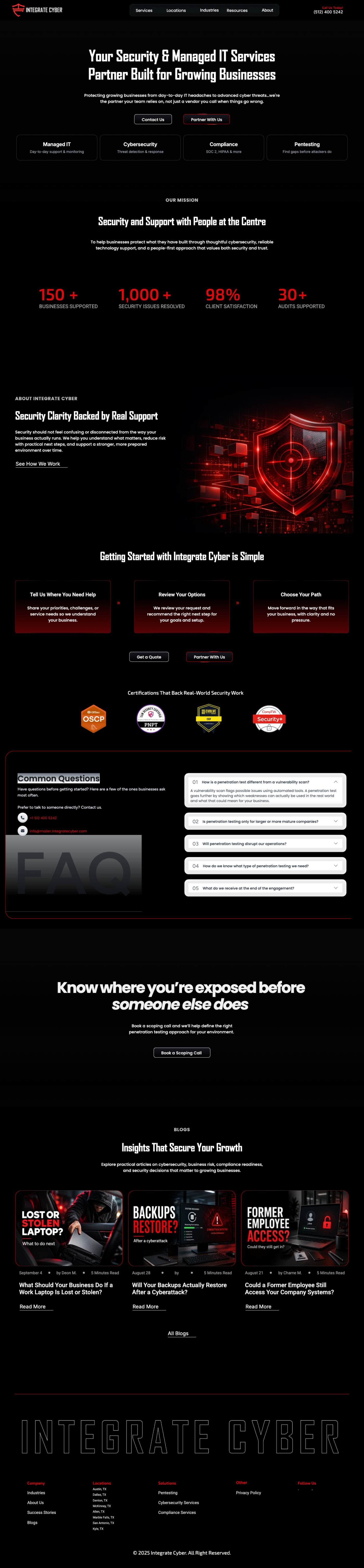
Plain-English services. Each service page opens with the problem it solves, then the scope and what the client receives, so buyers can judge fit before they talk to anyone.
Clear routes to a quote. Every page ends in one obvious next step: a quote, a scoping call or a partner enquiry.
How the time was spent
- Week 1, discovery and structure. A review of the old site, a map of every service and wireframes for the homepage and service pages.
- Week 2, visual design. Type system, components and high-fidelity desktop and mobile designs.
- Week 3, Framer build. Responsive build, blog CMS and interactions.
- Week 4, content, testing and launch. Content in place, mobile and speed checks, SEO basics, then launch.
The work, up close
Select any image to see it full size.
Website structure

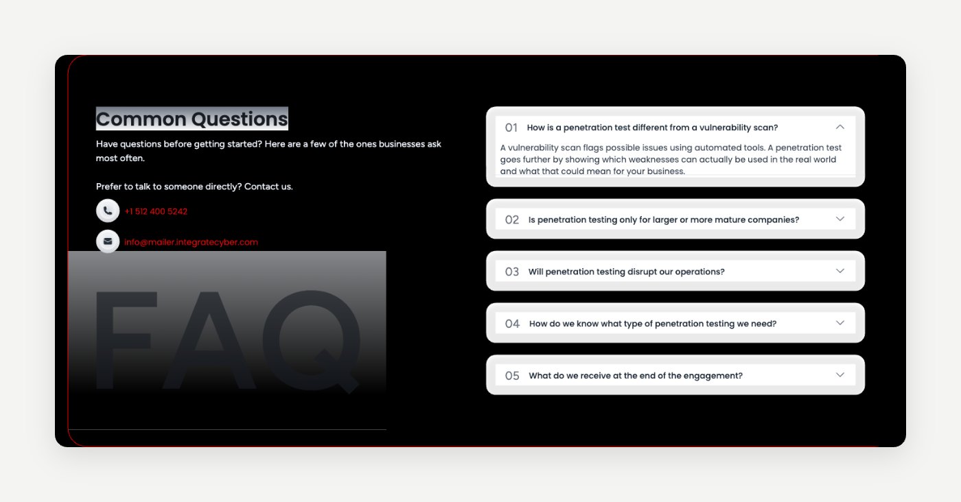
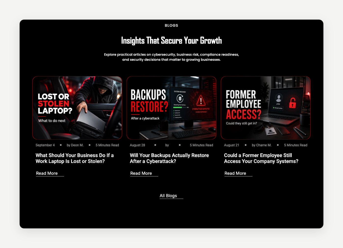
Section designs

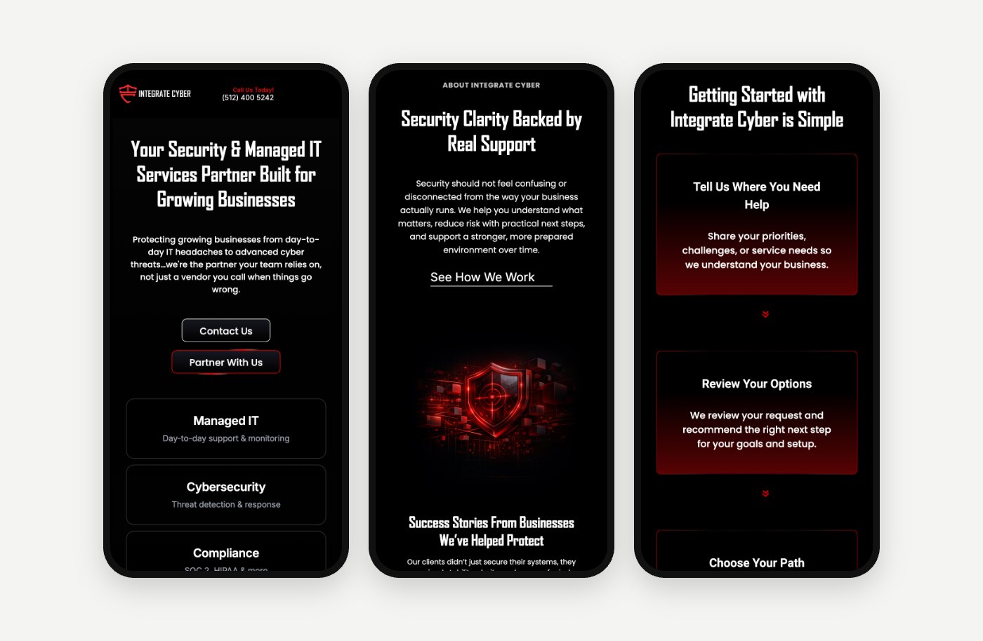
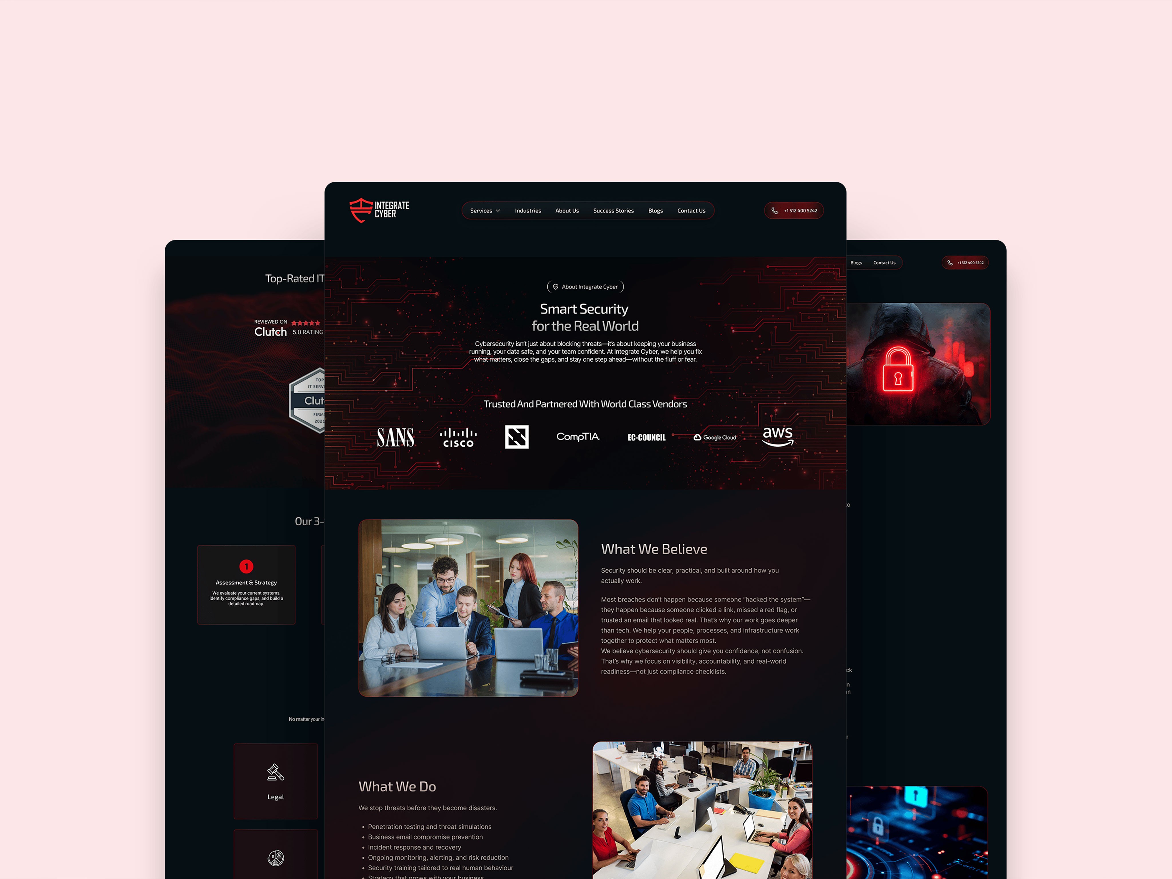
Pages and mobile
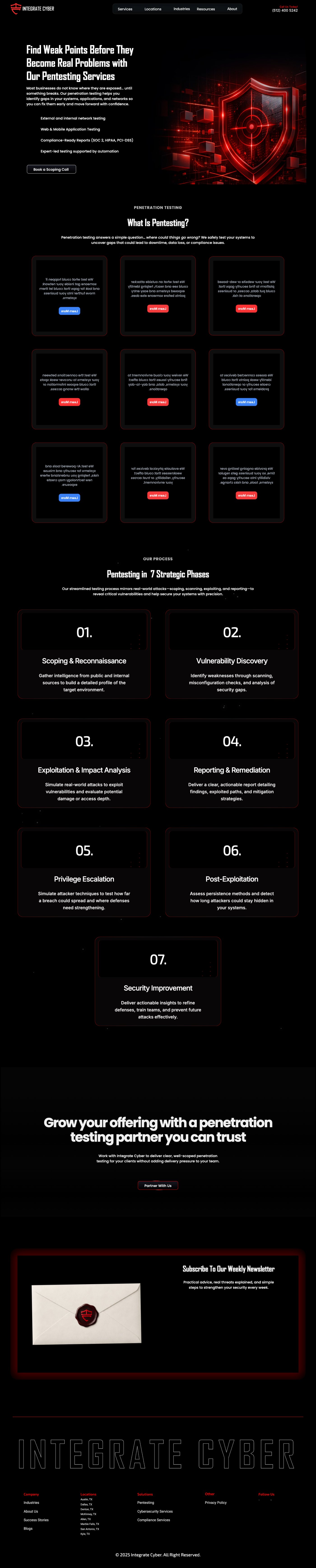
Full homepage


What changed
A bold, high-contrast design with a direct path from landing to requesting a quote. Clearer service pages, reworked content and structured calls to action remove friction, and the mobile experience is fast and clear.
The redesign strengthened how the brand is perceived and improved the quality of incoming leads.
They worked like real partners. Smart decisions, clear structure, and a cohesive, refined site.

Clients who'd do it again.
Four founders on three continents, in their own words. Want to hear it from one of them directly? Ask, and we'll introduce you.
They worked like real partners. Smart decisions, clear structure, and a cohesive, refined site.

Working with you felt effortless. They captured the calm, premium essence of our brand perfectly.

They built a clean, structured website with sharp messaging and solid design.

They delivered a refined identity and a clean, confident website.

Like what we built for this client? Let's make yours next.
Tell us about your business and what the website needs to do. You get honest thoughts and a fixed price, agreed before we start.
- A fixed price, agreed before any work starts
- You talk directly to the people designing and building
- Replies usually the same day
- Strategy and structure first, then design
- Built in Webflow or Framer, so your team can edit it without a developer