Tranzio
Introduction
Introduction
Client
Tranzio
Timeline
2 months
Year
2023
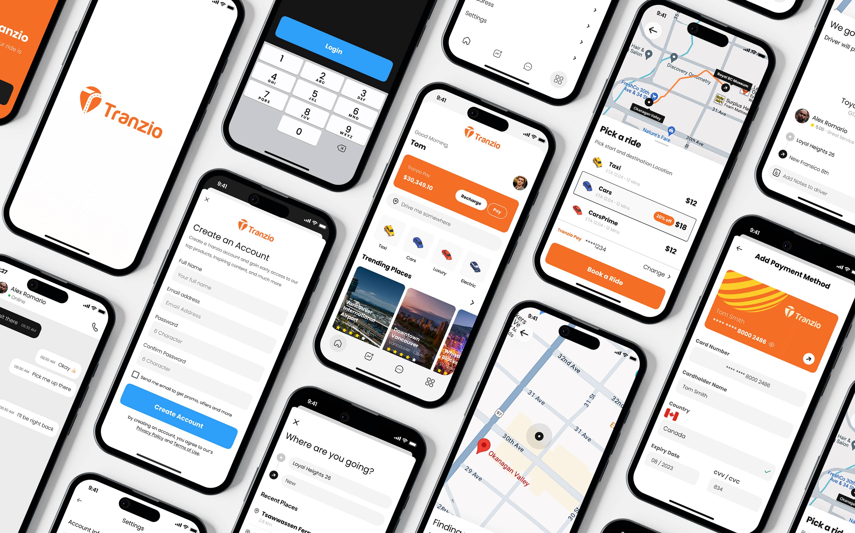
How Tranzio transformed their ride-hailing experience with a clean, intuitive, and future-ready mobile app interface.
Tranzio is a mobility startup building a modern ride-hailing ecosystem designed for reliability, simplicity, and seamless payments. They partnered with WebRay Studio to redesign their app’s user experience from the ground up — focusing on clarity, speed, and a more trustworthy visual system.
The goal was clear: build an interface that feels friendly, safe, and easy to navigate whether users are booking a ride, managing payments, or updating account settings.
In this project, we designed a complete mobile experience with refined flows, enhanced visual consistency, and a stronger brand presence across all user journeys.
Introduction
Client
Tranzio
Timeline
2 months
Year
2023
How Tranzio transformed their ride-hailing experience with a clean, intuitive, and future-ready mobile app interface.
Tranzio is a mobility startup building a modern ride-hailing ecosystem designed for reliability, simplicity, and seamless payments. They partnered with WebRay Studio to redesign their app’s user experience from the ground up — focusing on clarity, speed, and a more trustworthy visual system.
The goal was clear: build an interface that feels friendly, safe, and easy to navigate whether users are booking a ride, managing payments, or updating account settings.
In this project, we designed a complete mobile experience with refined flows, enhanced visual consistency, and a stronger brand presence across all user journeys.
Challenges
Challenges
An inconsistent UI, unclear booking flow, and outdated visuals were slowing down the user experience.
Before the redesign, users struggled with friction across the app. The booking flow felt crowded, navigation wasn’t intuitive, and the visual style lacked the warmth and clarity needed for a consumer mobility product.
Key pain points included:
– A cluttered booking process that confused new users
– Poor visibility for key actions like “Book a Ride” or “Add Payment Method”
– Outdated iconography and inconsistent spacing
– A generic onboarding experience that didn’t reflect the brand
– Payment screens that lacked structure and trust indicators
These issues created hesitation, especially for first-time users who rely on speed and confidence during a ride-hailing experience.
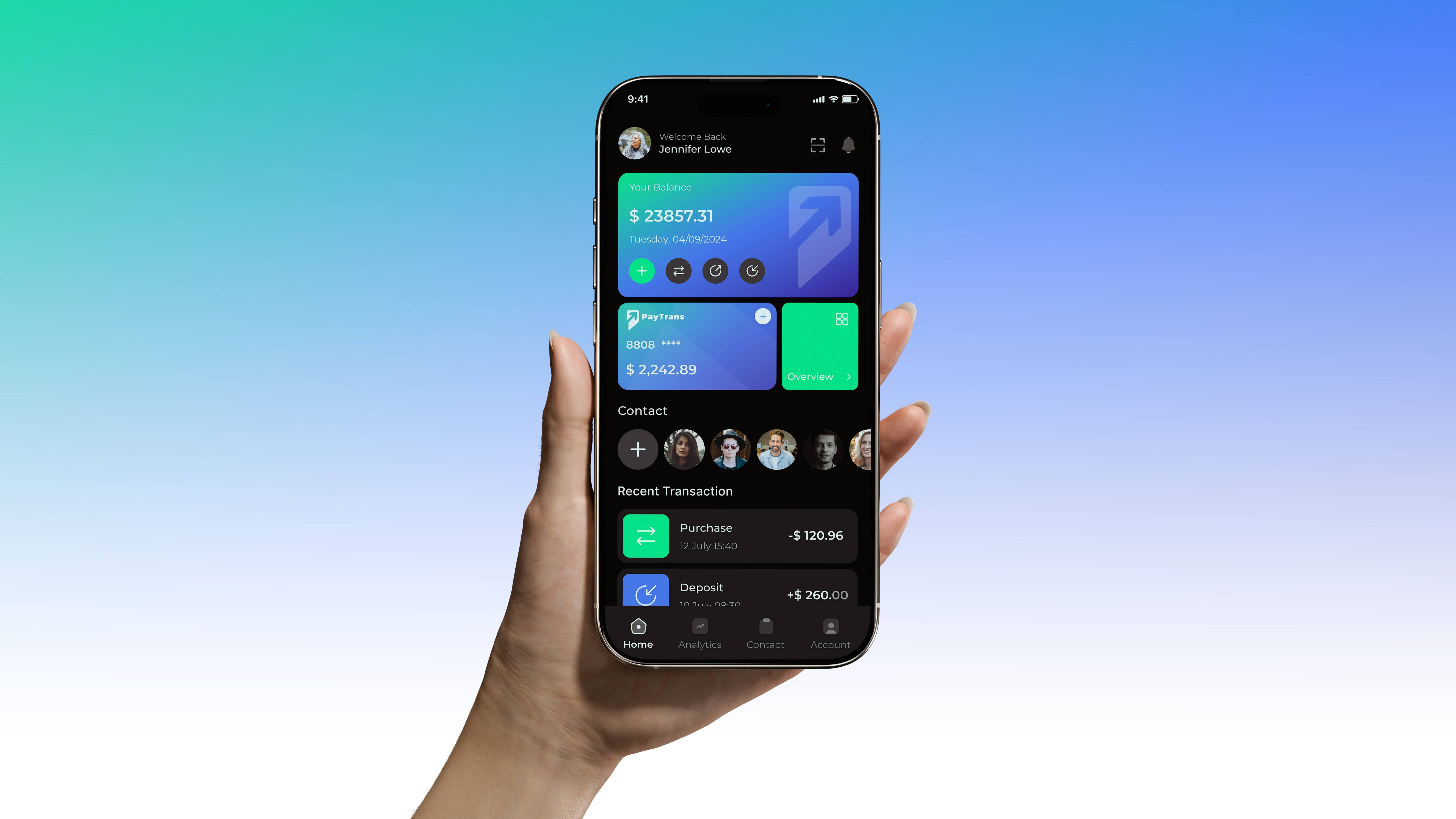
Results
Results
WebRay Studio delivered a complete UI/UX overhaul grounded in clarity, speed, and a fresh orange-driven visual identity that feels both energetic and trustworthy.
What improved:
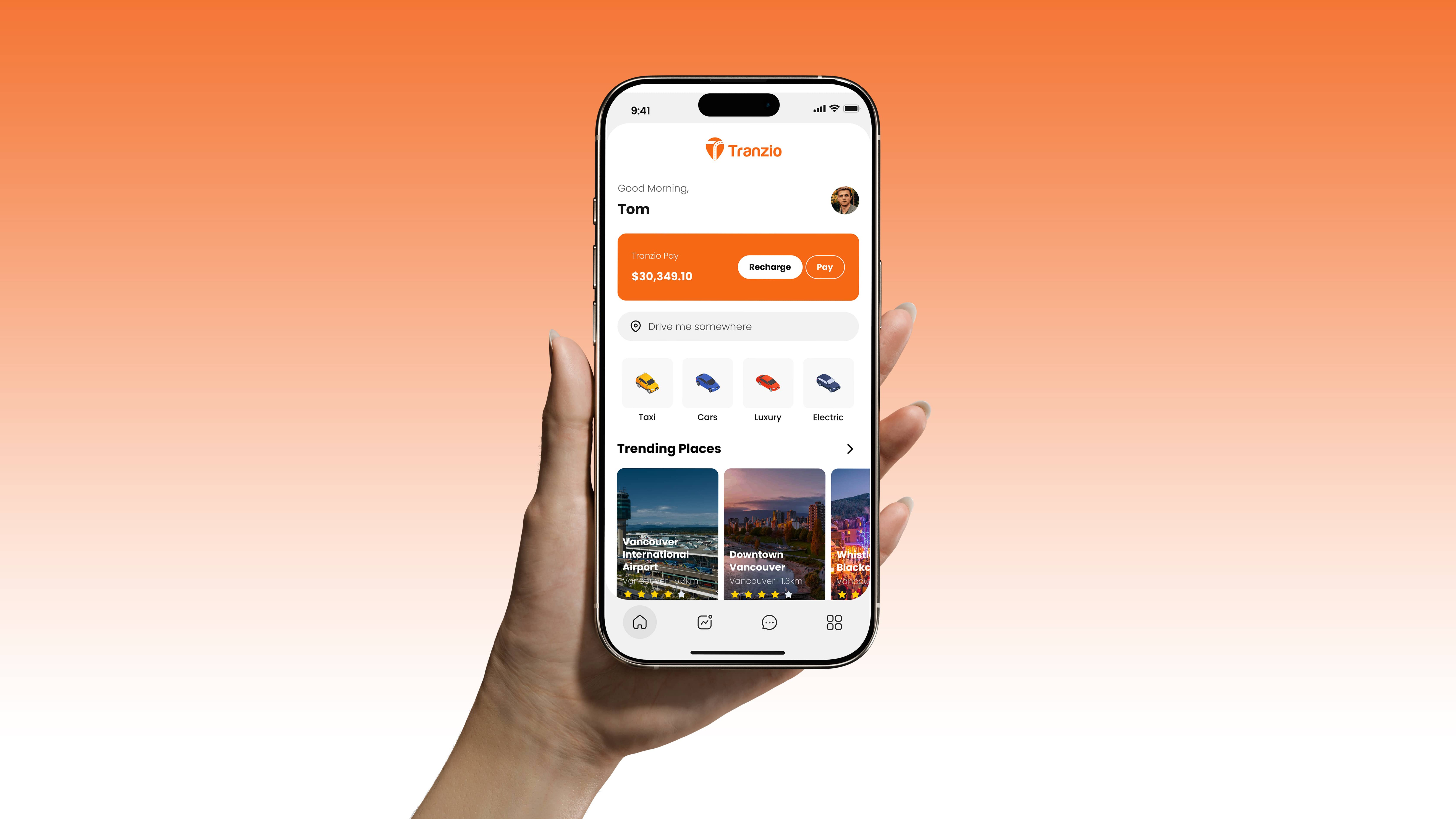
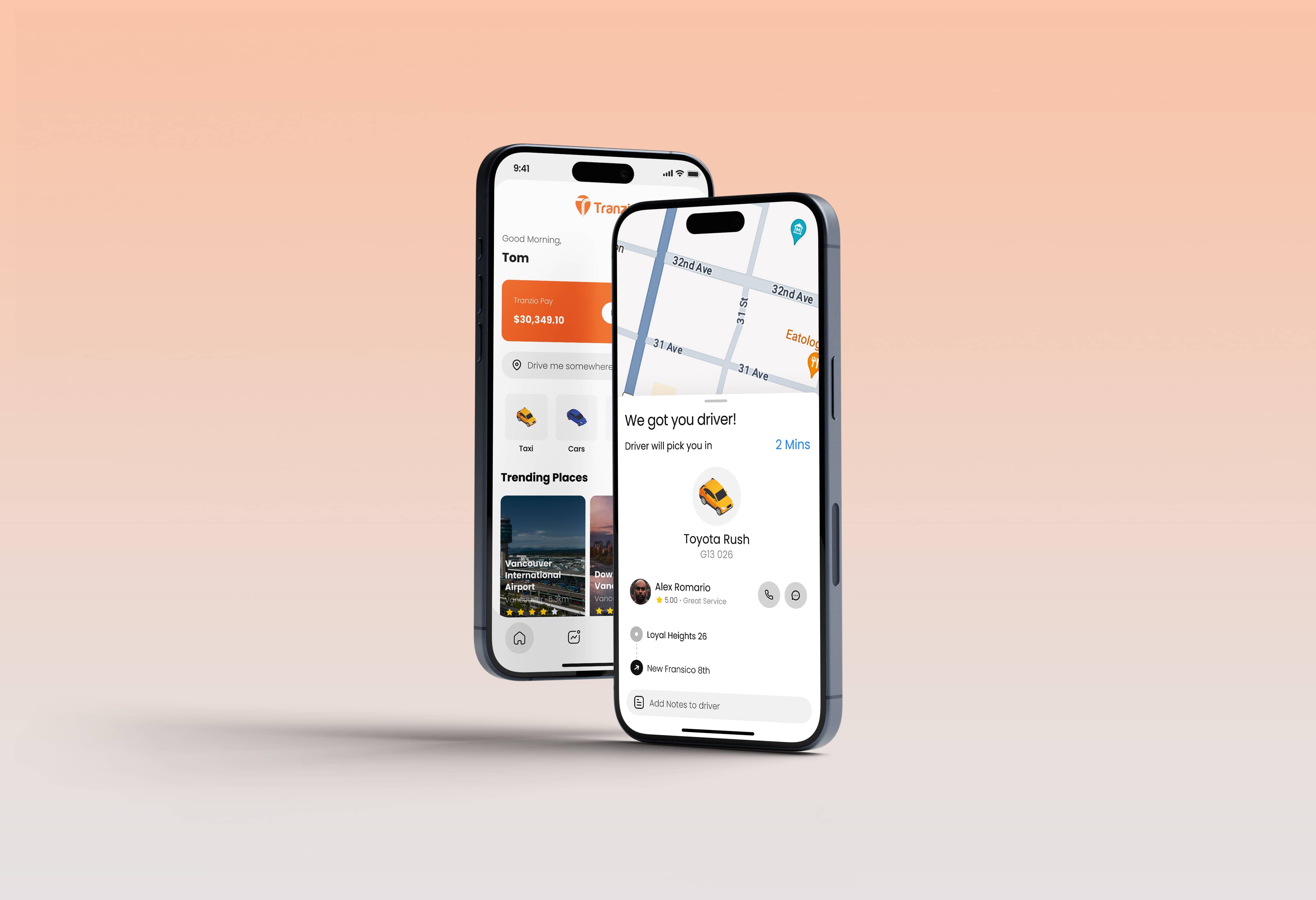
– A streamlined home screen with a clear balance, quick-action buttons, and immediate ride categories
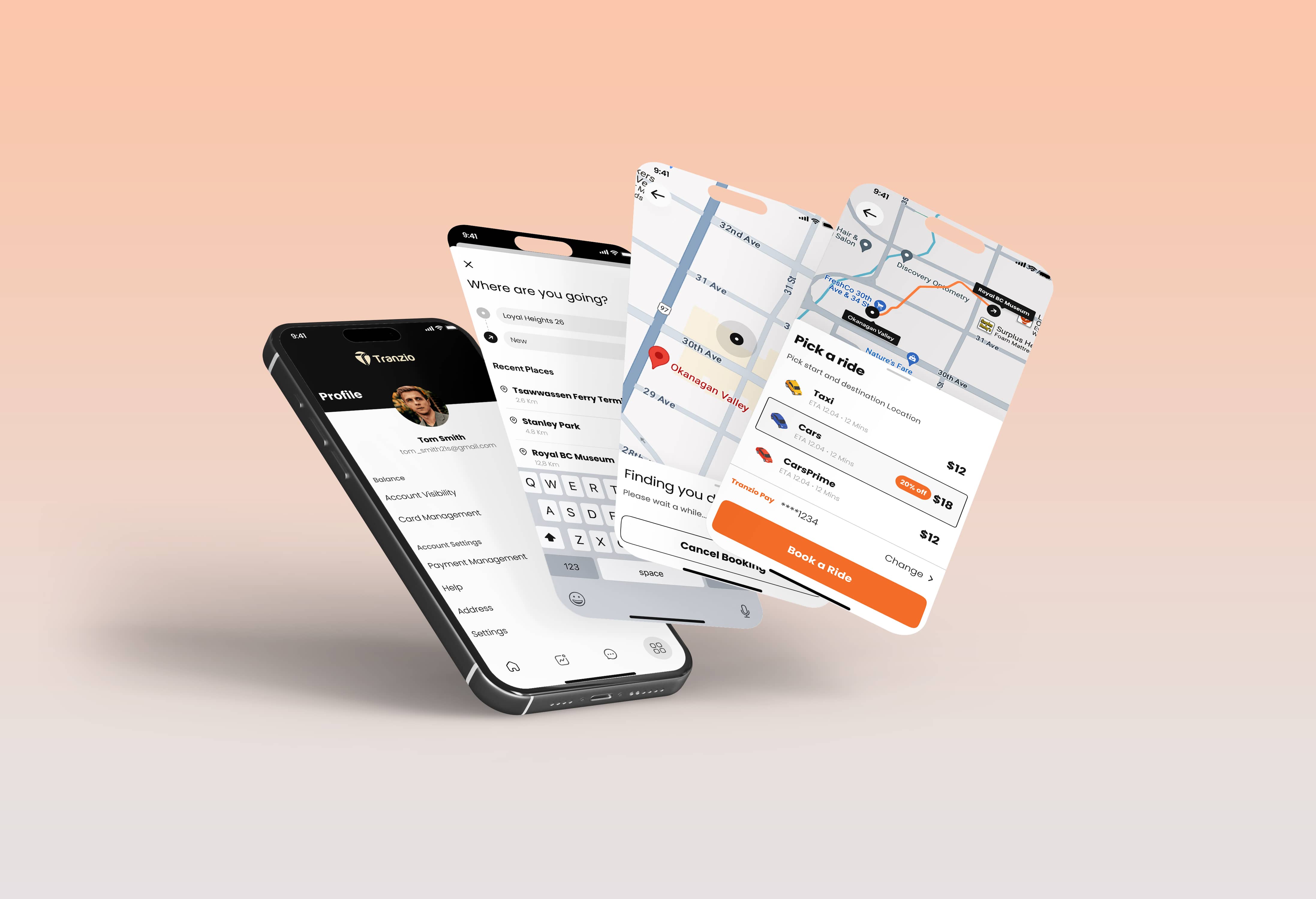
– A simplified booking flow that highlights pick-up, destination, vehicle type, price, and wait time at a glance
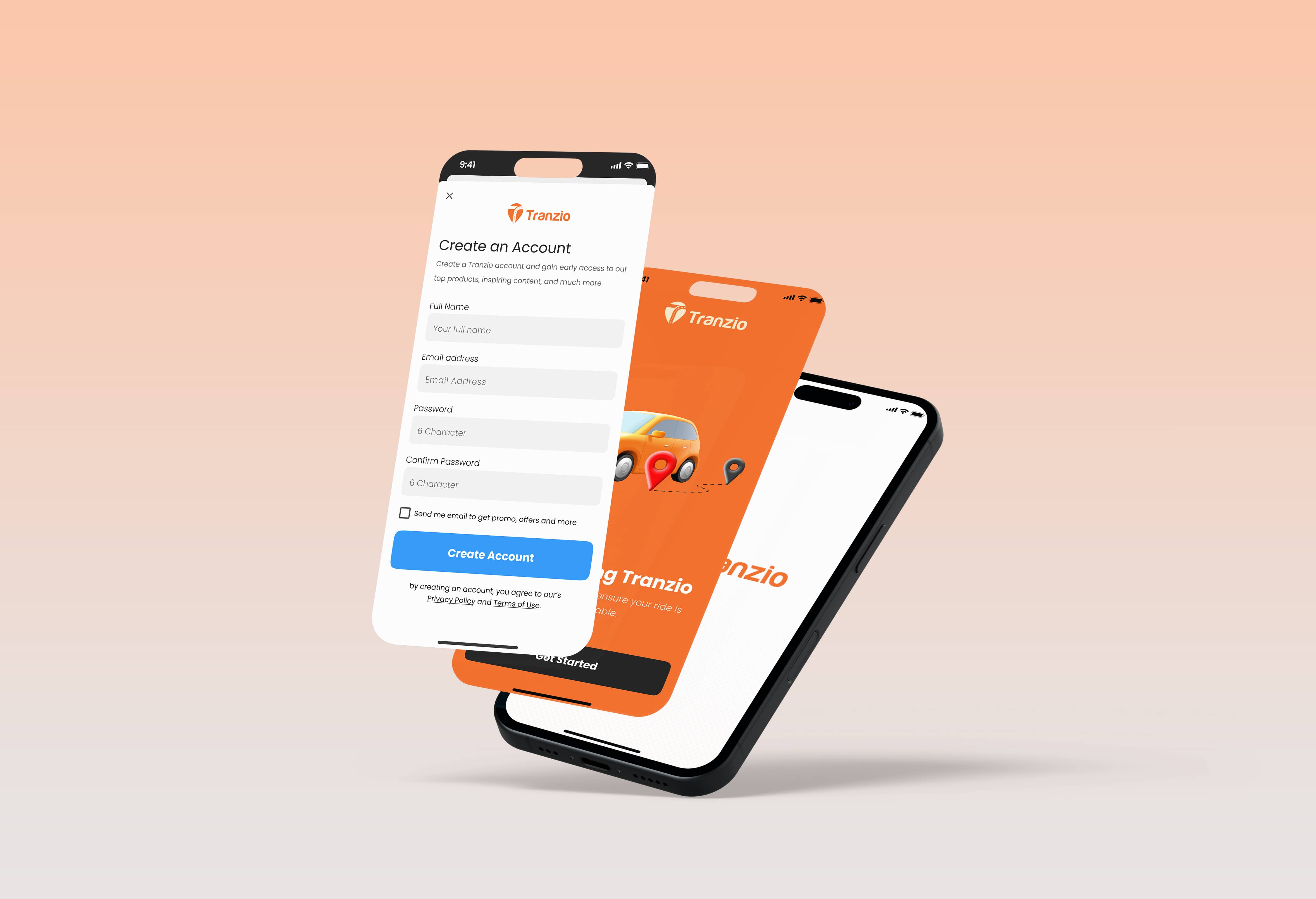
– Clean onboarding screens and user-friendly forms to boost sign-ups
– Optimized map interactions and real-time updates that reduce friction during ride tracking
– A refreshed payment management system with better hierarchy and safer-looking card inputs
– Consistent visual language across all screens, icons, spacings, and interactions
The redesigned app strengthened Tranzio’s brand perception, improved ease of use, and created a smoother experience from login to ride completion — helping the platform compete confidently in the modern mobility market.
A polished, intuitive, and friction-free mobile experience built for everyday riders.
Results
WebRay Studio delivered a complete UI/UX overhaul grounded in clarity, speed, and a fresh orange-driven visual identity that feels both energetic and trustworthy.
What improved:
– A streamlined home screen with a clear balance, quick-action buttons, and immediate ride categories
– A simplified booking flow that highlights pick-up, destination, vehicle type, price, and wait time at a glance
– Clean onboarding screens and user-friendly forms to boost sign-ups
– Optimized map interactions and real-time updates that reduce friction during ride tracking
– A refreshed payment management system with better hierarchy and safer-looking card inputs
– Consistent visual language across all screens, icons, spacings, and interactions
The redesigned app strengthened Tranzio’s brand perception, improved ease of use, and created a smoother experience from login to ride completion — helping the platform compete confidently in the modern mobility market.
A polished, intuitive, and friction-free mobile experience built for everyday riders.
More projects.
Explore the work we’ve crafted, thoughtful design, development, and strategy built to solve real problems and move businesses forward.


Get in touch.
Get in touch and let’s explore how we can strengthen your brand and build something meaningful together.
Office
Gullbergsgatan 5,
582 46 Linköping
Sweden
Get in touch.
Get in touch and let’s explore how we can strengthen your brand and build something meaningful together.
Office
Gullbergsgatan 5,
582 46 Linköping
Sweden
Get in touch.
Get in touch and let’s explore how we can strengthen your brand and build something meaningful together.
Office
Gullbergsgatan 5,
582 46 Linköping
Sweden